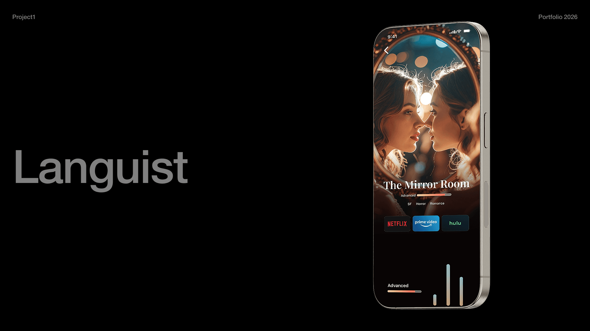
In class, I explore visual effects by creating brush-and-ink drawings on washi paper in a shared studio with about 50 students. I scanned the drawings, refined them in Photoshop, and reprinted them as physical works. I connected 50 pieces into one continuous sequence, treating them as a single line rather than separate lines.

Rinne - 輪廻 - means the endless cycle of death and rebirth in Buddhism.
I designed the front cover and the end cover can be connected so the title was named Rinne.

01

02

First, we drew lines on paper using a brush and ink. The materials created by each student were treated as shared assets that could be used by the entire class.

03

Once completing the drawings, we scanned the selected pieces and performed color correction in Photoshop. I inverted some of the materials from black to white, then printed them.

04

I connected the drawings into a single continuous line, creating a figure-ground reversal effect between black and white.

05

After creating these materials, the first idea that came to mind was to apply them to package design, as they reminded me of Japanese visual effects. This led to the concept of OKO, an incense brand inspired by seasonal Japanese flowers.  OKO is designed for Japanese people living and working abroad, providing them with a subtle reminder of Japan through scent.

06

First, I applied the black-and-white materials.

07

Then, I added color to evoke each season. I adopted floral scents that correspond to each season.

Next Project

Next Project

Portfolio2026

Fuminari AriyoshiBorn and raised in Kyoto

about

Born and raised in Kyoto, I grew up with parents who run their own Japanese restaurant. From UI/UX design to 3D projects in tools like Cinema 4D, I don’t limit myself—I’ll use any medium necessary to deliver the best design and meet the needs of each project.
→CSSWINNER STAR FEB'26

about

Born and raised in Kyoto, I grew up with parents who run their own Japanese restaurant. From UI/UX design to 3D projects in tools like Cinema 4D, I don’t limit myself—I’ll use any medium necessary to deliver the best design and meet the needs of each project.
→CSSWINNER STAR FEB'26

Create a free website with Framer, the website builder loved by startups, designers and agencies.